


The situation
A demanding instrument made harder to use
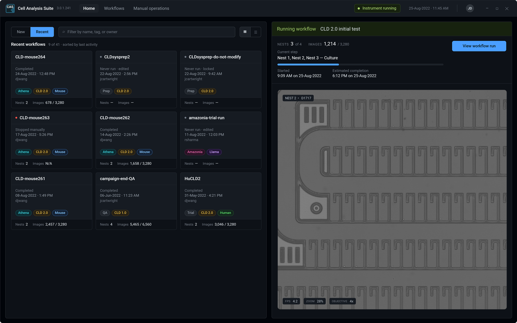
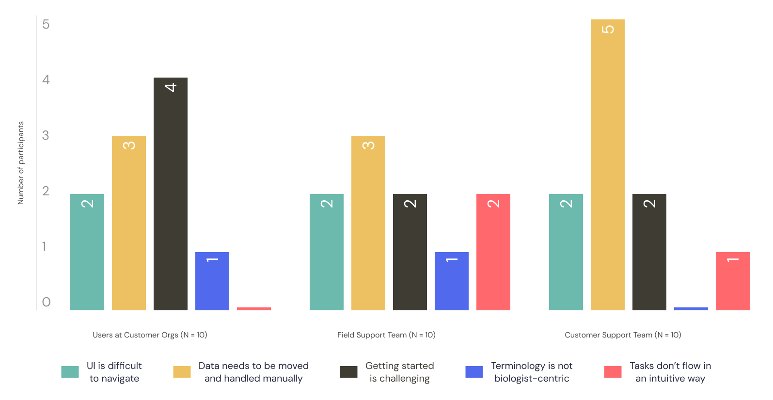
Running Berkeley Lights’ instruments took real expertise, and the software added friction instead of removing it. Features had been added without regard to existing workflows, and terms and constructs were inconsistent, sometimes within a single application.
Customers and field support complained heavily. One field support manager put it plainly: “If the instrument could be controlled by another software, I would jump ship.”
The work
An overhaul, shipped in stages
Most of the product and engineering team thought cosmetic fixes would quiet the complaints, and few saw the chance to make the platform cohesive and much more intuitive. I argued for an overhaul: one information architecture, shared components, and one design language across every application. Some of what people named, like moving data by hand, was a usability problem more than a UI one, so we paired the visible changes with under-the-hood work and small workflow tweaks.
Customer success didn’t want customers hit with too much change at once, and developers had a long backlog, so we rolled it out in stages: first one consistent language, then consistent navigation, then a new color scheme, and finally the design system with its components, icons, typography, and other tokens. Naming the constructs so they applied across the whole suite was a big exercise, and it didn’t depend on engineering, so it went first.
The work
Executive backing, express pace
Design needed more visibility and executive support across the company, so I established and chaired a monthly UX steering committee, sponsored by the CTO, CPO, VP of Customer Success, and VP of Program Management: the company’s first standing leadership forum on design quality. The committee backed the overhaul, which might not have happened without it. Engineering wanted to do the overhaul together and keep it apart from feature work, which meant we had a limited window to finish it at all.
My design team wanted months to build a design system first. I took their concern seriously, but engineering needed to see that a design system wouldn’t take so long it wasn’t worth it, so I called for an express build and built the first components with the team. Staging the overhaul helped: language, navigation, and color didn’t depend on the system, so they went first and bought us time for the design system, which took just over a month.
A much smoother experience that feels more intuitive and less cumbersome.
The outcome
Tickets down, NPS up
The overhaul went to alpha across eight customer accounts in late 2022, and the unified suite shipped before I left in early 2023. Platform NPS rose from -10 to +35, and tech support attributed a 67% drop in software-related support tickets to the UX changes.
Customers told us they were pleased with the consolidated experience and, more importantly, that they felt like the company was finally addressing a problem that had long been deprioritized in favor of new features.