
The situation
Six months to set things right
The company’s imager, Endeavor, needed an accompanying image analysis application before customers would consider a purchase. The engineering and data science team built the first version around the assumption that biologists would have technical knowledge that they often don’t. Feedback from customers and the Sales team indicated that the application missed the mark in a significant way.
The exec team decided to rebuild within six months, and a second miss wasn’t an option. Access to customers for research was limited.
The work
Putting the biologist at the center
Before a single screen was designed, the team needed to agree on who we were building for. With the help of our then Director of Marketing and our application scientist, I documented what we knew about the biologist who would use the platform. This became the scaffolding for understanding our primary user’s mental models, as well as their upstream and downstream workflows.
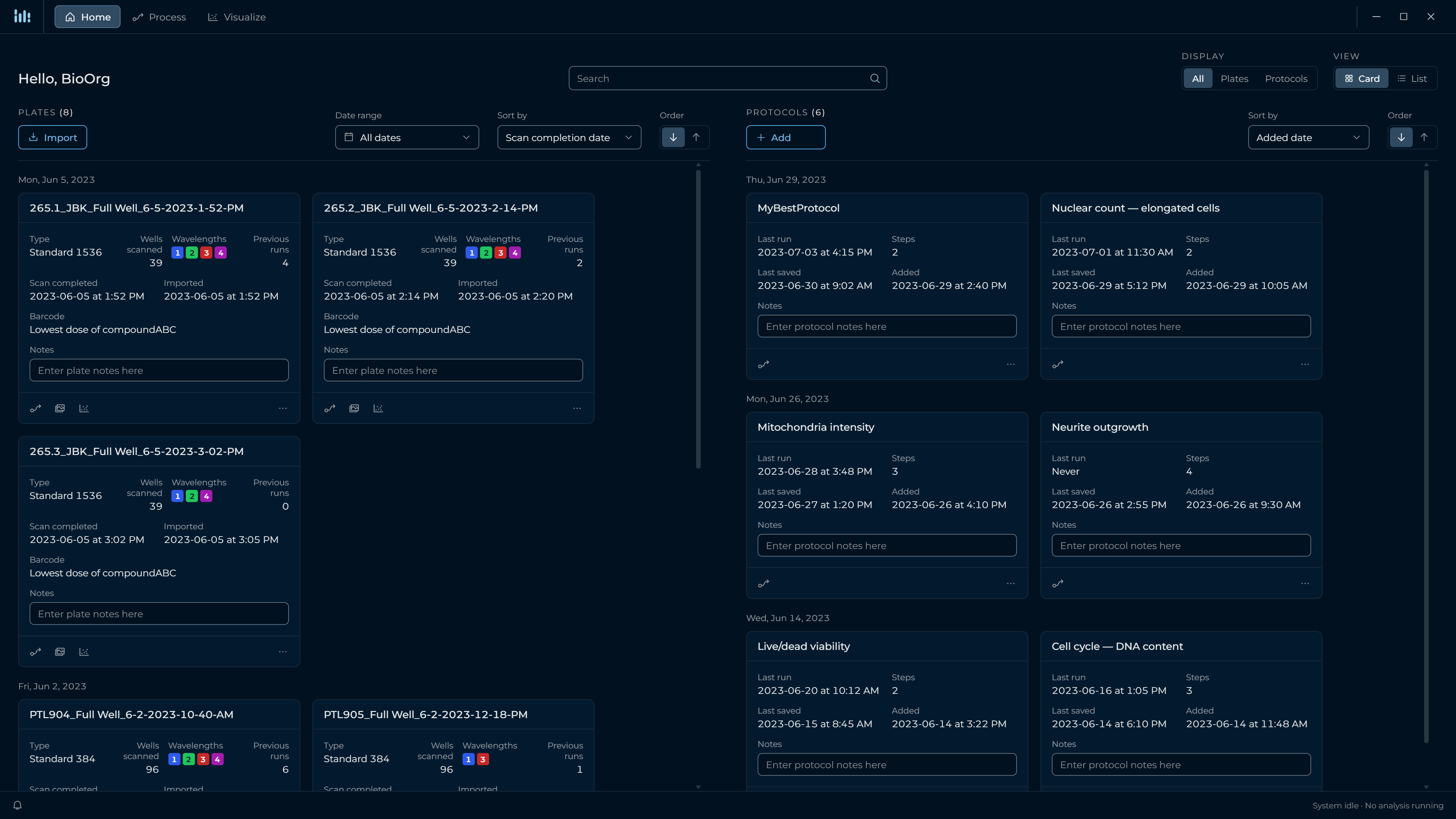
A new feature that came out of this reorientation was a home screen. Because of how experiments are often run at customer sites, people are away from our platform for weeks and need a way to jump back in without losing track of what they last did.
I used one shared language and structure across the application, intuitive for biologists new to the tool and flexible enough for analyses of varying complexity. Without much customer access, I designed with our in-house scientists as stand-ins and used the beta to check the result with customers.
The work
Teaching a team to work with a designer
Most of our engineers assumed that if something made sense to them, it would make sense to anyone, and that customers trained once would remember everything and read the manual end to end. In every conversation, I reinforced the basics: the system should guide users through a task on its own, and for a biologist, like most users, opening the manual is a last resort. I made the case that intuitive was a requirement, not a nice-to-have.
The engineers and data scientists had never worked with a designer, so from week one I ran weekly design reviews where they could question my workflows, bring their own ideas, and hear why one approach fit the requirements better than another. Decisions weren’t accepted just because I was the designer, and within a few months the reviews had shifted from me defending decisions to the team bringing me their own workflow problems to solve.
I also held sessions on the product’s concepts and information architecture, so the team worked from a shared understanding of the product, and I set up monthly design review calls with Sales and Support, who had previously felt removed from product decisions, to keep them in the loop. With no dedicated product manager, our data science lead and I shared product decisions.
The outcome
Optional, and every customer chose it
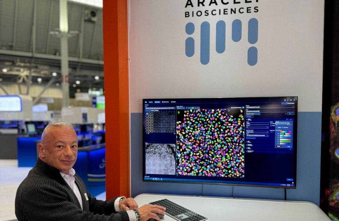
The beta, which I ran, drew strong positive feedback, and we shipped in November 2023. The reception at its unveiling at SLAS 2024 confirmed we had gotten what mattered right. The application is an optional add-on, and every customer since launch has chosen to add it. We have refined it from customer feedback since and extended it with new capabilities. Very few of the feature requests and service request tickets our product and support teams track concern usability.